For two years before the dot-com stock market bubble crashed, my husband Larry and I studied “stock charting” with one of the country’s top technical analysts. It’s one of the 450+ financial strategies and vehicles I’ve investigated over the last 25 years.
Stock charting looks at patterns in the charts of stocks, indexes and various market indicators to determine the best times to buy or sell, based on the knowledge that history repeats itself. (Frankly, I don’t have the patience for that kind of analysis and found it excruciatingly boring.)
 We owned a lot of tech stocks, and we’d check our retirement account balance every day because it was growing so fast. Some weeks we’d see such an enormous jump that we’d high-five each other shouting, “We’re rich! We’re rich!”
Yup, back then we were part of the “dumb money” – following the crowd like lemmings blindly following each other off a cliff. But I’m getting a little ahead of myself…
We were paying this analyst a good chunk of change for his coaching. Just when the dot-com bubble was peaking (as we now know with 20/20 hindsight), the analyst sent us this urgent one-sentence message:
If you only take one piece of my advice, make it this one:
Sell ALL your stocks now!”
Wow! There was no waffling. No equivocating. But… our stocks were still going up! Could we ride the bull just a little longer? Our greed glands were working overtime.
We decided to hedge our bets and sell a portion of our stocks and chart the remaining ones every day, selling each when we got a clear signal to.
As a result, we “only” lost 20% of the value of our retirement account when most investors saw their accounts plunge by 50% or more.
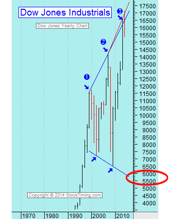
Since I have a very curious mind, I’ve continued following this analyst, even though I no longer own any stocks or stock mutual funds. He recently sent out a chart I’ll show you below that took my breath away… and will probably take yours away, too.
It’s a chart showing the long-term picture of the Dow Jones Industrial Average. He prefaced it with the same question I’ll ask you: Where do you think the Dow Jones wants to go next?
Based on historical patterns and the market tops and bottoms of the last two market crashes of 2000 and 2008 (the blue numbers 1 and 2), the index could plunge to around the 5,500 level from its current level of over 17,000 today:

As they say, a picture is worth a thousand words.
Here are two more reasons to be cautious…
The first is economist and Nobel Prize winner Robert Shiller, who predicted the 2008 real estate crash, recently noting that stocks, bonds and real estate are all on the expensive side. Most worrisome is what Shiller’s “cyclically adjusted price-earnings” (CAPE) ratio is showing today. The ratio stands at the fourth-highest level going back all the way to 1881 – and topped only by 1929, 2000 and 2007, all years that are synonymous with bursting bubbles.
Uh-oh.
The second reason to be worried is that, in a recent Investors Intelligence survey of money managers, the number of bears has fallen to the lowest level since 1987 (the year of Black Monday infamy).
The percentage of bears and bulls at any given time is considered a “contrarian” indicator. Because studies show that whether you’re talking about Mom and Pop investors or Wall Street “experts,” most investors buy and sell at the wrong times.
 As any good student of history knows, there will be another major stock market crash – the only thing we don’t know for sure is the date or the magnitude.
The Federal Reserve’s easy-money policies continue to force money into riskier assets and blow asset bubbles all over the place.
And with geo-political turmoil and terror rising quickly world-wide, the possibility of a “black swan event” that could throw markets and economies into a tailspin is growing. (The concept of a black swan event was popularized by Nassim Taleb. The idea is that the world and the economy are severely affected by events that are rare and difficult to predict – but that should be taken very seriously.)
Which brings us back to the question I posed at the start of this post. If you have a significant portion of your assets in the market… do you feel lucky? Well, do you?
Doesn’t it make sense to…
Hope for the best but have a “plan B”?
Out of the more than 450 different financial products and strategies I’ve investigated, my favorite “Plan B” is a properly structured Bank On Yourself dividend-paying whole life policy.
The many advantages of these plans include:
- Guaranteed, predictable growth
- Guaranteed to grow by a larger dollar amount every year
- Have never had a losing year for more than 160 years
- Tax advantaged – you can access both your principal and growth with no taxes due, under current tax law
- You have liquidity, access to and control of your money
- You can use your money in the plan to make a major purchase or to invest elsewhere – and your policy can continue to grow as though you never touched a dime of it
- You can (finally!) know the guaranteed minimum value of your account on the day you plan to tap into it – and at every point along the way
Know the Guaranteed Value of Your Nest-Egg
To find out what your bottom-line numbers and results would be if you added Bank On Yourself to your financial plan, request a free Analysis here, if you haven’t already.
 You have nothing to lose and a world of financial peace of mind to gain.


Speak Your Mind